Pantone has been choosing the colour of the year for 20 years. The first colour was Cerulean, a colour which represents the reassurance, confidence and connection at a time, when we were entering into the new millennium, and the insecurity was latent.
The Pantone Colour Institute has said that today, similar feelings of unestability gripping the world can be recognized. So they have chosen a blue colour again to enter in the new decade.
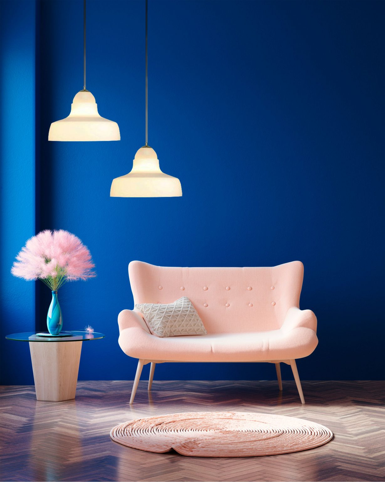
According to Pantone, Classic Blue is already being used in fashion, interior design, textiles and graphic design. It is a timeless, soothing shade that takes its cue from the night sky. It is the kind of colour that sets a calming atmosphere, and so interior design takes advantage of its benefits. Who wouldn’t want to use it in his hygge decoration?
You can use it to add a touch of colour, for example in cushions, carpets or even in chair’s upholstery. But if you are daring enough, walls are perfect for showing this colour, and giving the space a sense of sophistication and luxury. However, you should be careful, because it’s a pretty dark, eye-catching colour that should be used in moderation. Just paint an accent wall in Classic Blue to get the effect.
Are you already thinking where you’ll use it?


